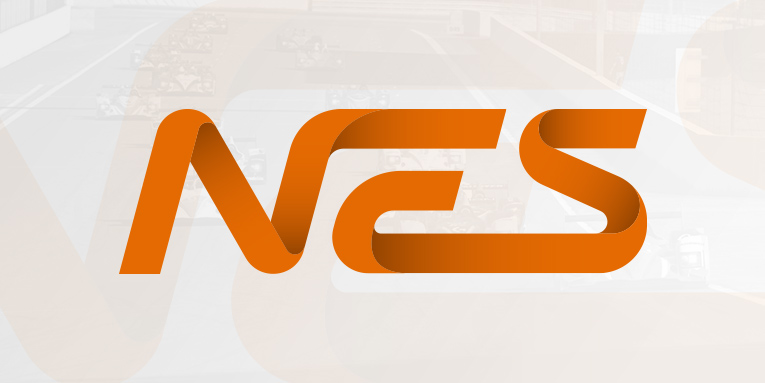
The NEO Endurance Series is just four years old and has grown to become one of the major endurance leagues in the iRacing community. A lot of things in this league have been improved over the years. Going into the fifth season it is time to improve the logo as well.
We are happy to introduce the new logo for the NEO Endurance Series, designed and created by co-founder Niel Hekkens.
![]()
“Because the series is going into its fifth season, I wanted to make something special,” said Hekkens. “First I wanted something completely different for the logo. I tried out different and new concepts, but I never was satisfied with the end result. At some point I thought, why not try this ribbon like concept. It turned out to be the one and I am proud with the result.”
“The new logo is the same idea as the old one, but much more modern and smooth. It has a much better flow. When I look at the new logo, it feels new and familiar at the same time.”
The color orange combines the red’s power and yellow’s friendliness. It resembles the feeling of motivation, joy, enthusiasm, and the spirit of adventure with your team.
A secondary, solid color, version of the logo will be published in the coming weeks. All new brand assets will be made available to everyone before the start of season 5.

- iRacing 101: The NASCAR iRacing Series and Other Year-Long Series
- Steven Wilson scores ‘wild’ eNASCAR Coca-Cola iRacing Series win over Minter and Honeycutt at Dover
- Could the Top 20 cut line affect the eNASCAR Coca-Cola iRacing Series playoff picture again in 2024?
- This Week in iRacing: April 23-29, 2024
- eNASCAR Coca-Cola iRacing Series Race Preview: Dover